GoFundMe’s rebrand shows how to scale without losing trust. Learn the brand-system moves UK solopreneurs can apply to net-zero and climate work.
Brand Systems That Scale: Lessons from GoFundMe
A rebrand isn’t a new logo. It’s proof you’ve outgrown your old story.
That’s why GoFundMe’s latest brand evolution (created with global studio Koto) is more interesting than most “fresh coat of paint” redesigns. The platform is expanding beyond individual fundraising into a broader giving ecosystem—supporting nonprofits (via Classy, now GoFundMe Pro), organisational giving, Giving Funds, Profiles, and smarter donation prompts like Intelligent Ask Amounts. The brand needed to stretch without snapping.
If you’re a UK solopreneur trying to grow—especially if your work touches community impact, green jobs, local projects, or the net-zero transition—this matters. Your audience is increasingly values-led. People want to know what you stand for, how you operate, and whether they can trust you. A coherent brand system makes that easy.
The big lesson: growth breaks brands before it breaks products
When a business expands, the product usually changes first: new services, new audiences, new pricing, new partnerships. The brand often lags behind—until customers get confused.
GoFundMe’s situation is a textbook version of what happens to many one-person businesses:
- You start with one clear offer (for GoFundMe, personal fundraising)
- You add adjacent services to grow revenue and impact (nonprofit tools, funds, profiles)
- Suddenly, your messaging, website, and visuals don’t explain the whole picture
- New customers aren’t sure what you actually do, and existing customers fear you’ve “changed”
This is especially relevant in the Climate Change & Net Zero Transition space, where trust and clarity are everything. Whether you’re selling sustainability consulting, retrofit advice, low-carbon transport services, ethical products, or running community energy campaigns, people want simple signals that you’re credible.
Snippet-worthy truth: Brand confusion is a conversion problem, not a design problem.
What GoFundMe and Koto did right: one idea that carries the ecosystem
Koto’s central idea for GoFundMe is: help adds up. That’s not just a tagline; it’s a strategy. The design system translates individual acts into collective momentum.
The “Progress Circle”: turning a UI detail into a brand asset
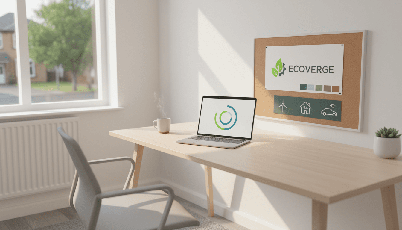
GoFundMe already had a familiar UI element: the fundraising progress indicator. Koto evolved that into a modular identity device: the Progress Circle.
Instead of being “just” a progress bar tied to a monetary goal, it becomes:
- A symbol of collective action (segments adding up)
- A flexible framing device for marketing and product
- A consistent visual language across touchpoints (web, motion, campaigns)
For solopreneurs, this is the key move: reuse what’s already working. Most small businesses throw away their best brand equity in a panic when they grow.
Here’s the practical translation:
- If you’ve got a recognisable shape, icon, layout, or recurring visual pattern—keep it.
- Promote it from “decoration” to “system”.
- Use it consistently across your website, proposals, social posts, and workshop decks.
Example: If your business is about carbon reduction audits, your “system element” could be a simple three-stage graphic you already use (Measure → Reduce → Report). Turn it into a consistent motif that frames every page and presentation.
A subtle logo refinement beats a dramatic reset
GoFundMe’s logo wasn’t replaced. It was refined, revealing the Progress Circle inside the existing ray. That choice signals continuity.
This is a smart stance: your audience doesn’t want to relearn you. They want to recognise you, but understand you better.
For a one-person business, a “dramatic reset” often creates two problems:
- You lose recognition with the people who already trust you.
- You burn time (and money) rebuilding assets instead of improving your offer.
A better approach is what GoFundMe did: evolve the identity so it can handle new use cases without confusing existing users.
Brand architecture: the growth move most solopreneurs skip
GoFundMe didn’t just update visuals. It clarified the relationship between its offerings, including a cleaner distinction between GoFundMe and GoFundMe Pro.
That’s brand architecture—and it’s one of the most overlooked growth tools for solopreneurs.
The solopreneur version of brand architecture
If you’re expanding beyond your original niche, you need a clear structure that answers:
- What’s the core offer?
- What are the add-ons?
- What’s a separate line for a different buyer?
A simple, effective model:
- Flagship (your main revenue driver)
- Support offers (audits, templates, retainers, training)
- Specialist track (a different buyer type, like councils vs SMEs)
In net-zero work, this matters because buyers vary wildly:
- A homeowner wants plain English and certainty.
- An SME wants ROI and compliance confidence.
- A charity wants legitimacy and community benefit.
- A local authority wants procurement-friendly clarity.
If your site treats them all the same, you’ll get polite interest and slow decisions.
Snippet-worthy truth: When you serve multiple audiences, your brand must explain the map.
Visual identity choices that support trust (and accessibility)
GoFundMe’s updated palette keeps green central (heritage and grassroots), but expands into a broader spectrum. It also uses a duotone approach to improve legibility and accessibility.
That detail matters more than designers sometimes admit. Accessibility isn’t a “nice-to-have”; it’s part of trust.
What this means for climate and net-zero businesses
In sustainability and decarbonisation, you’re often communicating complex information. Your design must reduce cognitive load.
A few practical rules I’ve found work reliably:
- Use fewer colours, more consistently. Variety looks “creative”; consistency looks “credible”.
- Design for scanning. Most decision-makers read on mobile between meetings.
- Make contrast non-negotiable. If your charts and calls-to-action aren’t readable, you’re losing leads.
Typography also got a bespoke update with GoFundMe Sans, designed to echo the circular system and stay clear in interfaces.
You don’t need a custom font, but you do need typographic discipline:
- One font family (two at most)
- Clear hierarchy (H1/H2/H3 that looks obviously different)
- Body text that reads comfortably on a phone
Messaging that changes by audience, without changing your values
GoFundMe’s verbal guidelines distinguish between:
- GoFundMe as a Helpful Guide
- GoFundMe Pro as a Helpful Partner
That’s a high-skill move: different tone, same identity.
Build a “tone ladder” for your own business
If you’re a solopreneur, you’re already doing this informally. You write one way on LinkedIn, another in a proposal, another in a workshop.
Make it explicit. A simple tone ladder:
- Public content: clear, confident, simple language
- Sales conversations: specific outcomes, timelines, proof
- Delivery: direct, structured, supportive
If you work in net zero transition, your tone must avoid two traps:
- Doom-and-gloom (people shut down)
- Vague positivity (people don’t act)
The sweet spot is what GoFundMe’s system aims for: humanity, community, optimism—without losing clarity.
Snippet-worthy truth: Optimism converts when it comes with a next step.
Action plan: a “progress circle” exercise for UK solopreneurs
You don’t need a rebrand. You need a system that can scale as your offer grows.
Here’s a practical exercise you can do this week.
Step 1: Identify your “native asset”
Pick one thing that already shows up in your business:
- A recurring diagram, framework, or checklist
- A distinctive shape or icon you use repeatedly
- A headline style, pattern, or layout your audience recognises
This is your version of GoFundMe’s progress indicator.
Step 2: Turn it into a modular system
Create 3–5 variations you can use everywhere:
- A full version (for hero sections and covers)
- A cropped version (for social tiles)
- A small stamp (for PDFs and footers)
- A motion idea (simple slide or reveal, if you do video)
Step 3: Clarify your brand architecture in one sentence
Use this format:
- “I help [audience] achieve [outcome] through [primary offer], with [support offers] available if needed.”
Example (net-zero consultant):
- “I help UK SMEs cut energy costs and emissions through practical carbon reduction plans, with staff training and reporting support if needed.”
Step 4: Build one landing page per buyer type
If you serve multiple audiences, stop forcing them through the same doorway.
Create separate pages for:
- Homeowners
- SMEs
- Charities/community groups
- Public sector/procurement
Each page should show: problem, proof, process, pricing range or starting point, and a clear call-to-action.
Step 5: Measure brand clarity like a growth metric
Track these monthly:
- Website conversion rate (inquiry / sessions)
- Discovery call close rate
- “What do you do?” questions in sales conversations (fewer is better)
- Time-to-decision (should shorten as clarity improves)
Where this fits in the net-zero transition story
A lot of climate communication is stuck in two modes: activism or compliance. The net-zero transition needs a third mode: credible businesses that make action easier.
GoFundMe’s evolution shows how to grow without losing trust: keep recognisable equity, build a system from a simple idea, and clarify how offerings connect. That’s exactly what climate-focused solopreneurs need as demand rises for retrofit, renewable energy, sustainable transport, circular economy services, and local resilience work.
If your business is expanding, don’t wait until your website feels like a junk drawer. Pick your core idea, build a repeatable system around it, and make it obvious who each offer is for.
What’s the one “native asset” in your business you could promote into a system—starting this month?