Learn how So Energy’s “invisible” service branding offers a playbook for UK solopreneurs to stand out, build trust, and win leads consistently.
Branding the Invisible: Stand Out Without Shouting
Energy is one of the hardest products to market because, for most people, it’s a non-event. If the lights are on and the bill doesn’t sting, nobody’s celebrating their supplier. That’s exactly why Studio Blackburn’s refresh of So Energy is a useful case study for any UK solopreneur trying to grow in a crowded digital market.
This matters to the Climate Change & Net Zero Transition conversation too. The UK’s net-zero goals don’t get delivered by policy documents; they get delivered by millions of everyday choices—switching suppliers, adopting low-carbon habits, and trusting newer renewable energy brands enough to move away from the “Big Six” default.
So if you sell something that feels invisible—a service, a subscription, consulting, coaching, software, bookkeeping, operations support—this is your reminder: people don’t buy what they can’t notice.
Why “invisible” offers are harder to sell than you think
The core problem is attention, not quality. In commoditised markets, customers assume the experience will be “roughly the same,” so they pick the easiest option or stick with what they’ve got.
For UK energy customers, that stickiness has a name: inertia. Even with price comparison sites, switching rates can stay stubbornly low because the perceived upside rarely feels worth the hassle.
For solopreneurs, it’s the same pattern in a different outfit:
- Prospects say they want better service, but they still hire the person they recognise.
- Your offer might be objectively stronger, but it looks like everyone else’s on LinkedIn.
- You’re “reliable” and “friendly”… which is what your competitors say too.
A useful (and slightly uncomfortable) truth: when a buyer can’t tell the difference, you get compared on price or convenience. And that’s a terrible place to build a one-person business.
What So Energy got right: make a memory, not a mood
Studio Blackburn’s refresh (building on the 2021 identity) focuses on a simple strategy: create fast recognition through consistent assets, then use messaging to reframe what the service means.
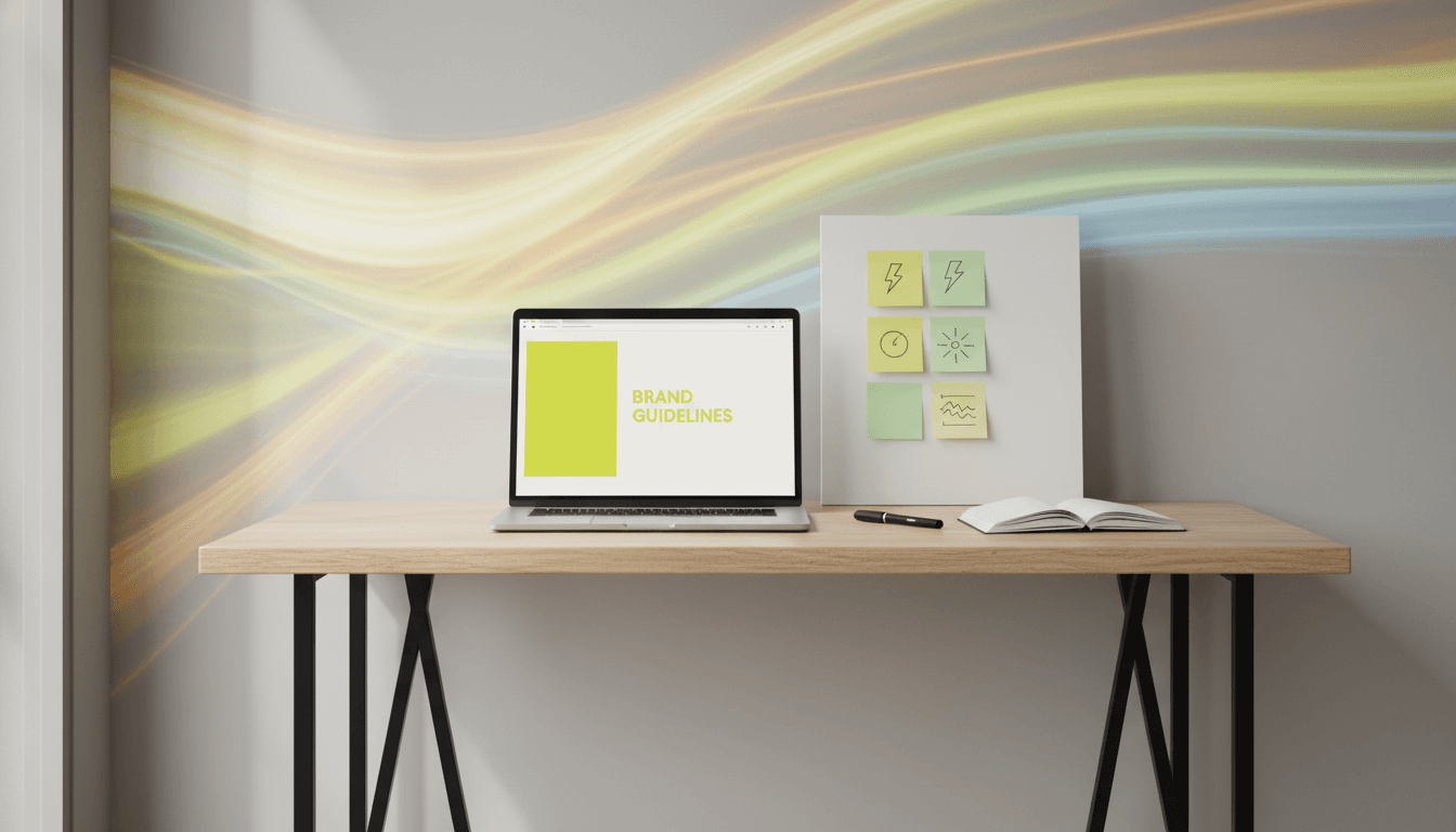
Electric Yellow: a distinctive asset that compounds
The refresh centres on a bold signature colour—Electric Yellow—described as “unhuman yet natural, loud yet approachable.” In a sector dominated by safe blues and greens, that’s the point. It’s deliberately confrontational.
Here’s the practical lesson for solopreneurs: a distinctive brand asset is a growth lever because it compounds.
Everywhere the brand appears—comparison sites, customer comms, social posts—the same colour acts like a visual shortcut. Over time, customers don’t “remember the ad,” they remember the signal.
If you’ve ever built trust through repeated touchpoints (newsletter, Instagram, a podcast guest slot, a webinar), you already understand the compounding effect. This is the visual version.
“Consistency is not a design preference. It’s a sales strategy.”
“Live Life Energised”: stop selling the feature, sell the outcome
The refresh introduces “Live Life Energised” as So Energy’s external voice. Instead of talking like a utility (tariffs, kilowatt hours, billing mechanics), the brand talks like an enabler.
That’s a major shift from rational to emotional messaging.
Not “We do renewable energy.”
But “Energy is what lets you get on with the life you actually care about.”
In net-zero terms, this is important. If renewable energy brands only talk about technical inputs, they lose mainstream audiences. People want to understand the human payoff: stability, trust, a simpler life, doing the right thing without a degree in climate policy.
For solopreneurs, the translation is blunt:
- Don’t sell “SEO audits.” Sell “more qualified leads from people already searching.”
- Don’t sell “bookkeeping.” Sell “knowing exactly what you can pay yourself.”
- Don’t sell “automation.” Sell “getting your evenings back.”
Motion, icons and illustration: the underrated trust-builders
One of the sharpest parts of the So Energy work is how it uses a broader design system—motion bursts, refreshed illustrations, redesigned icons—to make an intangible service feel present.
Why motion works (especially online)
Motion isn’t decoration; it’s clarity plus energy. In digital marketing, motion helps people feel the brand before they intellectually process it.
For a solopreneur, this doesn’t mean you need a full motion system. It means:
- Use short, repeatable animations (logo sting, highlight pulse, simple transitions)
- Keep them consistent across reels, ads, and your website
- Make motion support comprehension (what to click, what matters, what happens next)
Icons and micro-clarity reduce buyer friction
Energy customers want “fast, simple answers.” That’s true in every service.
When a buyer is uncertain, they look for small signals:
- Is this person credible?
- Will this be a pain?
- Do they have a process?
- Will I be embarrassed if I choose them?
A clean icon system, consistent layouts, and readable “how it works” sections reduce cognitive load. Lower cognitive load = higher conversion rates.
If your website is beautiful but confusing, it’s losing you leads.
Challenger positioning: “We Do Energy, You Do You” is a growth move
So Energy’s campaign line “We Do Energy, You Do You” makes the positioning explicit: the supplier is the invisible infrastructure that enables customer individuality.
That’s clever because it addresses the central paradox of commoditised services:
- You want the service to be forgettable day-to-day (reliable, seamless).
- But you need the brand to be memorable at the moment of switching.
Solopreneurs have the same paradox.
Your delivery should feel effortless to the client.
But your marketing has to be unmistakable.
A positioning test you can run this week
If you replaced your business name with a competitor’s, would your homepage still make sense?
If yes, your positioning is too generic.
A stronger version gives prospects a clear “why you” in one sentence:
- Who it’s for (and who it’s not)
- What outcome you create
- How you do it differently
Example formula:
“I help [specific person] get [specific outcome] without [common pain], using [your method].”
Not perfect, but it forces clarity.
Practical solopreneur takeaways: build your “Electric Yellow” system
You don’t need a rebrand every year. You need a small set of assets you can repeat until people associate them with you.
1) Pick one distinctive brand asset
Choose one thing that becomes your signature. Options:
- A specific colour pair (not “blue and white”; something recognisable)
- A visual motif (shapes, frame, corner device)
- A photo style (lighting, background, composition)
- A typographic style (headline font pairing)
- A recurring graphic element (underline, highlight bar, sticker device)
Rule: it must be easy to apply across every touchpoint.
2) Define your emotional promise (not just your service list)
So Energy didn’t only say “we’re renewable.” They said what life feels like with them.
Write a one-line emotional promise you can stand behind:
- “You’ll feel in control of your numbers.”
- “You’ll stop second-guessing your marketing.”
- “You’ll finally have a process you trust.”
Then make sure your case studies and testimonials back it up.
3) Audit your customer journey for friction
Most “branding problems” are actually journey problems.
Check:
- Can someone understand what you do in 10 seconds?
- Is there one clear next step (book, enquire, download)?
- Do you explain your process in plain English?
- Do you show proof where the buyer is likely to hesitate?
Friction kills switching. Your job is to reduce it.
4) Make your marketing consistent enough to become familiar
The So Energy point isn’t “pick yellow.” It’s “repeat the same signals until they stick.”
If you post on LinkedIn, for example:
- Use one consistent post template for 60 days
- Keep the same opening structure for your series
- Use the same highlight colour and typography in carousels
You’re building recognition, not a one-off design moment.
How this supports net zero (and why it matters for your business)
Branding isn’t a shallow layer on top of sustainability. It’s one of the mechanisms that makes sustainable choices mainstream.
When a renewable energy supplier becomes easier to recognise, trust, and choose, switching becomes less intimidating. When switching becomes normal, market pressure increases. That’s part of how the net-zero transition accelerates—through consumer confidence, not just carbon accounting.
For solopreneurs working in climate-adjacent industries (renewable energy, home retrofit, green finance, sustainable products, environmental consultancy), your brand is doing double duty:
- It wins attention and leads
- It reduces perceived risk in making a “new” choice
That’s real impact.
Your next step: make your offer visible enough to be chosen
So Energy’s refresh shows a practical path for standing out in a saturated market: be consistent, be bold in a specific way, and talk about the life your customer wants—not the mechanics you provide.
If you’re a solopreneur, the goal isn’t to look like a big company. It’s to look like a clear choice.
What would happen if your next 30 days of marketing used one distinctive visual signal and one sharp emotional promise—repeated relentlessly—so people finally remembered you when they’re ready to switch?