Learn how So Energy’s brand refresh shows solopreneurs how to market invisible services—stand out online, reduce buyer friction, and grow leads.
Branding Invisible Services: Lessons from So Energy
UK solopreneurs have a weird problem in 2026: you’re expected to show up everywhere—website, LinkedIn, email, proposals, reels—yet the thing you’re selling is often invisible.
If you’re a consultant, coach, accountant, virtual assistant, fractional marketer, or sustainability specialist, your “product” is mostly trust, process, and outcomes. It’s intangible. It can also look suspiciously similar to everyone else’s from the outside.
That’s why Studio Blackburn’s refresh of So Energy (a renewable energy supplier) is such a useful case study. Energy is the ultimate invisible service: you only notice it when it fails, and most people would rather not think about it at all. The refresh shows a practical way to make an “invisible” offering memorable without turning your marketing into a wall of features.
This post is part of our Climate Change & Net Zero Transition series, where we look at what actually helps people adopt greener choices—because getting to net zero isn’t just policy and infrastructure. It’s also communication, trust, and brand clarity.
The real challenge: people don’t buy “energy”—they buy confidence
If your service is intangible, customers aren’t comparing products. They’re comparing risk.
That’s true for energy switching (Will my bills be right? Will support be helpful? Will it be a hassle?) and it’s true when a client hires you (Will this person deliver? Will I look foolish if I choose them? Will this create extra work?).
So Energy’s brief was to be seen as a confident challenger in a market dominated by incumbents. Your version of that might be: “credible alternative to bigger agencies,” “specialist alternative to generalists,” or “premium alternative to cheap freelancers.”
Here’s the stance I’ll take: for invisible services, brand isn’t decoration—it’s your risk-reduction system.
A quick net zero lens: trust drives adoption
In the UK’s net zero transition, households and SMEs are constantly asked to do new things—switch tariffs, choose renewable energy suppliers, adopt heat pumps, change transport habits. Behaviour change doesn’t happen because the facts are perfect. It happens when the option feels clear, safe, and socially normal.
Brand is one of the tools that makes “new” feel “safe enough.”
What So Energy’s refresh gets right (and why it works)
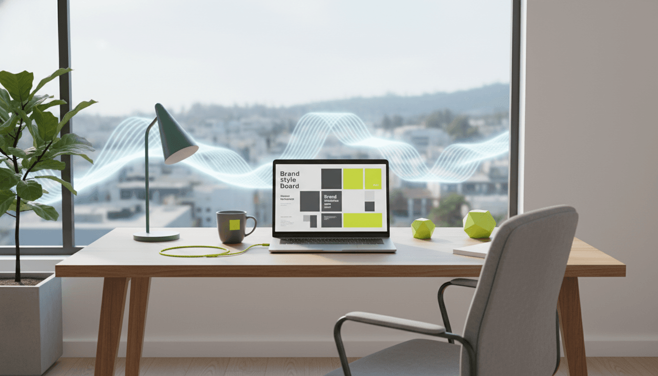
Studio Blackburn built the refresh around a few clear moves: a distinctive colour, an emotional message, and a flexible visual system for modern digital touchpoints.
1) One bold, ownable cue beats ten “nice” design choices
The anchor is a colour positioned between yellow and green—Electric Yellow—described as “unhuman yet natural, loud yet approachable.” In a category dominated by predictable blues and greens, that’s a deliberate interruption.
This matters because most solopreneurs do the opposite:
- They pick “safe” brand colours because they don’t want to put anyone off
- They end up looking like every other profile in a LinkedIn scroll
- They try to compensate with more content, more posts, more explaining
The smarter move is to choose a brand asset you can own and repeat until it becomes memory.
Memorability is a growth strategy when you don’t have big-budget reach.
For So Energy, the colour isn’t just aesthetic. It becomes a visual shortcut across comparison sites, customer comms, and social assets.
Solopreneur application: pick one dominant recognisable asset and commit for 90 days.
- A colour that’s uncommon in your niche
- A photo style (high-contrast studio portraits, or documentary-style client work)
- A shape system (thick borders, highlighter blocks, stamp motifs)
- A typographic choice (not “trendy,” just consistent and readable)
Consistency compounds. Especially when you’re small.
2) Emotional positioning beats feature-dumping (even in “boring” sectors)
The refresh introduces the line “Live Life Energised”—a shift from rational messaging (tariffs, kWh, billing) to an emotional framing: energy as an enabler of life.
That’s not fluffy. It’s strategic.
Feature messaging is easy to copy. Emotional positioning is harder to steal because it’s tied to a point of view.
Solopreneur application: write one sentence that answers this:
- What does my service make possible for someone’s life or business?
Examples:
- “Get your evenings back” (bookkeeper)
- “Launch without the chaos” (project manager)
- “Grow leads without becoming a content machine” (marketing consultant)
- “Make net zero reporting feel manageable” (sustainability consultant)
Then use it as the backbone of your website hero, LinkedIn headline, and proposal intro.
3) Design for the places people actually meet you
So Energy’s refresh extends into motion, illustration, and iconography—because brand is experienced in dozens of small moments: social posts, app screens, onboarding emails, help centre pages.
For solopreneurs, your equivalent touchpoints are:
- Your LinkedIn profile (banner, headshot, featured section)
- Your lead magnet (PDF, workshop deck, checklist)
- Your proposal template and invoice
- Your email onboarding sequence
- Your “how we work” page
If these don’t look like the same business, you’re asking prospects to do extra cognitive work. They feel friction, even if they can’t name it.
Friction kills switching. Brand reduces switching friction.
In the net zero context, this is exactly what slows adoption: people stick with the default provider because it’s familiar. Your future clients do the same with whoever they already know.
A practical framework: how to brand an “invisible” offer
Here’s a simple way to translate the So Energy approach into solopreneur branding decisions.
Step 1: Decide what you want to be remembered for
Pick one primary association. Not three.
Good examples:
- “Fast, calm onboarding”
- “No-jargon sustainability guidance”
- “High-converting copy for B2B services”
- “Premium design with tight delivery”
If you try to be remembered for “quality, friendly, professional, innovative, affordable,” you’ll be remembered for nothing.
Step 2: Create an unmistakable visual cue
So Energy uses Electric Yellow as a mnemonic. Your cue could be:
- A single bold accent colour used everywhere (buttons, headings, dividers)
- A repeated layout pattern for carousels and case studies
- A signature graphic element (underline swoosh, dot grid, chunky highlight)
Rule: if someone removed your logo, would your post still look like you? If not, you’re under-using your assets.
Step 3: Shift your message from “what it is” to “what it does”
“So Energy supplies renewable energy” isn’t compelling on its own. “Live Life Energised” reframes the job-to-be-done.
Try this structure:
- Outcome: what improves?
- Feeling: what changes emotionally?
- Trade-off: what do they stop doing?
Example (fractional ops):
- Outcome: projects ship on time
- Feeling: the team relaxes
- Trade-off: you stop firefighting
Now you have copy that sounds human.
Step 4: Build a touchpoint checklist (and actually use it)
Brand work fails when it’s trapped in a PDF brand guideline nobody opens.
Your minimum viable checklist:
- LinkedIn banner + headline aligned to your positioning
- One-page website with clear offer + proof + CTA
- Proposal template that matches your visual system
- A repeatable content format (e.g., weekly case note, teardown, client story)
- An onboarding email sequence that sets expectations
Do these well and you’ll outperform a “full brand package” that never gets deployed.
Common solopreneur mistakes this case study helps you avoid
Mistake 1: Confusing “professional” with “forgettable”
Many UK service businesses default to muted palettes and generic stock photos because it feels safe. The cost is invisibility.
Professional doesn’t mean bland. Professional means clear, consistent, and confident.
Mistake 2: Trying to win on features alone
In commoditised markets, feature comparison pushes you into a race you can’t win.
So Energy still needs competitive pricing and reliable service, but the refresh is designed to let them compete on perception and affinity as well.
For you, that might mean:
- a clearer niche
- a more distinctive style
- a stronger point of view
- proof that’s easy to scan (before/after, metrics, timelines)
Mistake 3: Rebranding without changing the messaging hierarchy
A logo refresh won’t fix a muddled offer.
The So Energy work pairs visuals with a clear external voice (“Live Life Energised” / “We Do Energy, You Do You”). Visual identity and message hierarchy move together.
If you’re considering a refresh this quarter, start by rewriting:
- your homepage hero
- your LinkedIn headline
- your service page (what you do, who it’s for, what changes)
Then design around that.
What this means for net zero businesses and climate-focused solo experts
Net zero progress depends on adoption: switching suppliers, choosing renewable tariffs, upgrading homes, electrifying fleets, changing procurement.
Branding often gets dismissed as “marketing fluff” in climate work. I disagree. Clear brand identity helps normalise climate action by making it feel straightforward and credible.
A climate-focused solopreneur (carbon accounting, ISO 14001 support, ESG comms, green ops) has an extra challenge: you’re selling something people feel they should do, not always something they want to do.
That’s exactly when emotional clarity matters. Not guilt. Not jargon. Just a confident, human promise and a consistent identity that makes you easy to pick.
Next steps: a quick visibility sprint you can do this week
If your brand currently feels “fine” but not memorable, run a five-day sprint:
- Day 1: Choose one bold accent colour (and stop tweaking)
- Day 2: Rewrite your positioning into one sentence: “I help X do Y without Z”
- Day 3: Update your LinkedIn banner + featured section to match
- Day 4: Create one repeatable post template (carousel or single-image)
- Day 5: Update your proposal/invoice header so your brand follows through
You don’t need a full redesign to get results. You need fewer choices, used more consistently.
Where could a clearer, more confident brand reduce friction for your next client—so choosing you feels like the obvious move?