A practical rebrand guide for UK solopreneurs: build a living brand system (type, colour, motion, flexibility) that attracts better leads.
Rebrand Smarter: 6 Moves That Win Better Clients
A rebrand isn’t a logo project. It’s a sales and trust project.
Most UK solopreneurs only realise this when leads dry up, referrals slow down, or their pricing starts getting questioned more than it should. They look at their website and think: It’s fine. But “fine” doesn’t convert in a market where your competitors are one TikTok series or one sharp landing page away from looking more credible than you.
This post sits inside the British Small Business Digital Marketing series for a reason: your brand is the container your marketing sits inside. If the container looks dated, inconsistent, or hard to understand, your SEO, socials, email funnels, and paid ads have to work twice as hard.
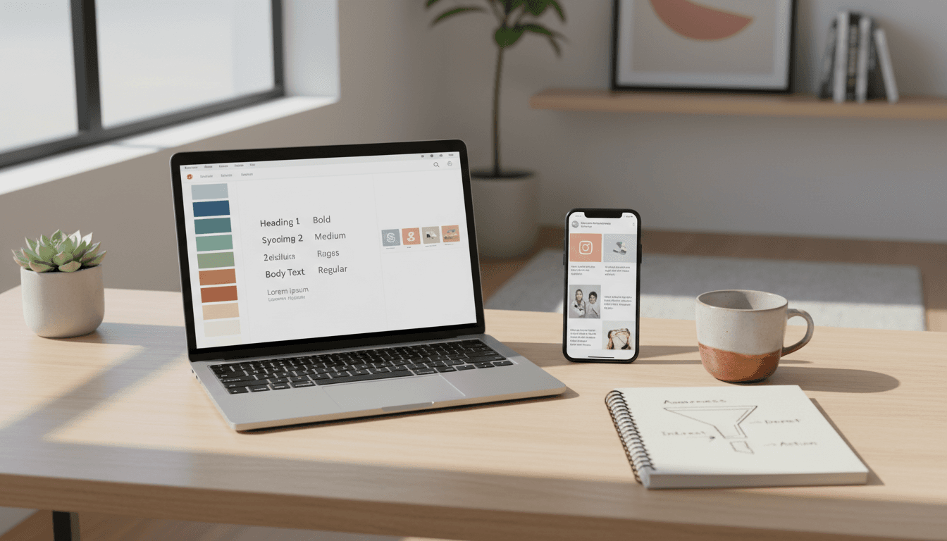
Frontify’s recent thinking (via a report discussed in the Creative Boom article) is a useful provocation: modern rebrands work best as living brand systems, not static assets. I agree—and for solopreneurs, it’s actually good news. You don’t need a £30k agency package. You need a system you can run.
1) Treat your rebrand as a conversion project, not a design project
If you only change how you look, you’ll miss the point.
A rebrand should solve a measurable business problem: weak lead quality, low website conversion, confusion about what you do, inconsistent social content, poor recall, or “I found you but went with someone else” conversations.
The solopreneur rebrand scorecard
Before you touch visuals, write answers to these:
- Who are we trying to attract now (and who are we repelling)? Be specific: industry, budget level, urgency, values.
- What’s the one sentence people should repeat after visiting your site? If you can’t say it, your customers won’t.
- Which 3 actions matter most in the next 90 days? e.g., book a call, download a guide, buy a starter package.
- What will we measure? At minimum: website conversion rate, call bookings, email sign-ups, and enquiry-to-close rate.
If your rebrand doesn’t improve at least one of those, it’s mostly decoration.
Snippet-worthy truth: A rebrand that doesn’t change behaviour is just a redesign.
2) Use typography as positioning (your “price signal”)
Your type choices broadcast who you’re for—often more loudly than your copy.
The source article highlights the idea that great type has personality and shouldn’t feel interchangeable. That matters for solopreneurs because prospects use design to guess:
- Are you premium or budget?
- Are you modern or old-school?
- Are you detail-led or slapdash?
Practical rules that keep you out of trouble
- Pick one primary typeface family (with multiple weights). Consistency beats clever.
- Test readability on mobile (most UK small business traffic is mobile-heavy). If your body text is hard work, your bounce rate will rise.
- Design for motion, not just pages: headers should still look good in Instagram Reels covers, YouTube thumbnails, and carousel graphics.
A quick exercise: the “competitor swap” test
Open three competitor sites. If you could swap your type choices with theirs and nobody would notice, you’re not using typography to position yourself.
3) Build a colour system that improves recall (and ad performance)
Colour isn’t about trends. It’s about memory.
The Creative Boom piece calls out how trend colours come and go. For solopreneurs running digital marketing on limited budgets, colour has two practical jobs:
- Stop the scroll (social)
- Speed recognition (ads, email headers, thumbnails)
What a “living” colour system looks like
Instead of one palette in a PDF, create:
- Core colours (2–3): your consistent anchors
- Support colours (3–5): for charts, callouts, backgrounds
- Campaign accents (1–2): seasonal or offer-based colours you can rotate
February is a useful moment to do this: Q1 campaigns often need clarity and urgency (new budgets, new goals, post-holiday resets). A campaign accent can signal “this is timely” without rebuilding your whole identity.
Avoid the most common small business colour mistake
If everything is “brand colour”, nothing stands out.
Give yourself a dedicated CTA colour (used only for buttons/links), then keep it sacred. This one change can improve click behaviour on landing pages because it reduces visual noise.
4) Add sound and motion early—because your marketing is already in motion
If your rebrand ignores motion, it will feel outdated the day you launch.
The source article argues motion should be fundamental, not an afterthought. For solopreneurs, you don’t need a fancy animation studio. You need repeatable motion rules.
Minimum viable motion (that looks professional)
Pick 2–3 simple behaviours and use them everywhere:
- Text reveal style: fade, slide, or wipe (choose one)
- Rhythm: fast and snappy or slow and premium
- Transitions: consistent cuts between scenes
This matters directly to digital marketing because your content is likely distributed via:
- Instagram/TikTok short-form video
- LinkedIn video snippets
- YouTube Shorts
- Webinar promos
- Animated ads
If your motion style is consistent, your content becomes recognisable even when your logo isn’t visible.
Sonic branding for solopreneurs (yes, it’s relevant)
Most solopreneurs won’t create a “Netflix sound”. But if you do podcasts, YouTube, webinars, or paid video ads, you can create a light sonic identity:
- a 2–4 second intro sting
- one consistent background music style (not random tracks)
- a signature sign-off line
People trust what feels familiar. Familiarity is built through repetition.
5) Design for flexibility: fixed, flex, free (steal this framework)
Flexibility isn’t optional when you’re marketing across platforms.
The Creative Boom article references Mozilla’s “fixed, flex, free” approach. It’s one of the cleanest ways to stop brand systems becoming either:
- too rigid (so you avoid using them), or
- too loose (so you look inconsistent).
Here’s how to apply it to a one-person business
Fixed (never changes):
- your logo/wordmark
- your primary typeface
- your 2–3 core colours
- your key message (one-liner)
Flex (adapts by channel):
- templates for carousels, case studies, lead magnets
- photography style (more formal on site, more human on socials)
- icon sets (simpler for mobile)
Free (room to evolve):
- campaign accents
- seasonal content series branding
- collaborations/guest appearances
If you build your rebrand this way, you won’t be redesigning every time you launch a new offer.
6) Build cultural currency by listening (and committing to a point of view)
The fastest way to look “generic online” is to copy what’s already working for everyone else.
The source article’s final theme—listening and cultural currency—lands especially well for solopreneurs. You don’t need to be big to be culturally relevant. You need to be consistently specific.
The simplest version of cultural currency for a small business
Pick one tension in your category and take a stance.
Examples (adapt these to your niche):
- “Most agencies sell ‘content’. We sell conversion proof.”
- “I don’t do endless retainers. I do 90-day sprints with measurable outcomes.”
- “I’m anti-busywork marketing. If it doesn’t drive enquiries, it goes.”
Then bake that stance into:
- your homepage headline
- your pinned social post
- your lead magnet topic
- your sales call structure
Consistency here is a growth strategy. It makes you easier to remember and easier to refer.
The solopreneur rebrand checklist (do this over 10 working days)
A full rebrand can sprawl. Keep it tight.
- Day 1–2: Positioning
- rewrite your one-liner
- define your “ideal lead” and deal-breakers
- Day 3–4: System choices
- type, colour system, photo style
- fixed/flex/free list
- Day 5–6: Marketing assets first
- homepage sections
- lead magnet landing page
- social templates (carousel + video cover)
- Day 7–8: Motion + sound rules
- 2–3 motion behaviours
- optional sonic sting for video/webinars
- Day 9–10: Proof + rollout
- update case studies to match new positioning
- announce with examples (before/after, what changed, who it’s for)
Your website shouldn’t be the last thing you update. It should be the place everything ties together.
What to do next (so the rebrand actually brings leads)
A rebrand that supports UK small business digital marketing does three things: it makes you clearer, more memorable, and more consistent across channels. That’s how you attract better-targeted customers without increasing your workload.
If you’re considering a rebrand this quarter, don’t start with moodboards. Start with the system: type, colour, motion, and a message that draws in the right people and politely pushes away the wrong ones.
The question I’d leave you with is this: if your best-fit customer landed on your site today, would they recognise themselves in your brand—immediately?